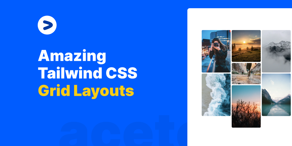
Amazing Tailwindcss Grid Layout Examples
I've been using Grid design layouts in almost all of my projects. I love how easy it is to create complex layouts with Tailwindcss grid. In this article, we will learn how to create amazing Grid layouts with Tailwindcs grid and React.
What is a grid
A grid is basically a set of cards or content laid out in some sort of rows and columns. A simple example of a grid is something like this:


This is a simple grid of 3 columns on tablets and desktop screens and 1 column on mobile screen.
Let's take a look at the code of this.
The code snippet grid grid-cols-1 md:grid-cols-3 gap-10 defines the grid layout. grid-cols-1 means that there will be 1 column on mobile screen. md:grid-cols-3 means that there will be 3 columns on tablet and desktop screens. gap-10 means that there will be a 10px gap between each column.
As and when you start adding more columns, the grid will automatically adjust itself.
Creating a Masonry Layout with Tailwindcss Grid


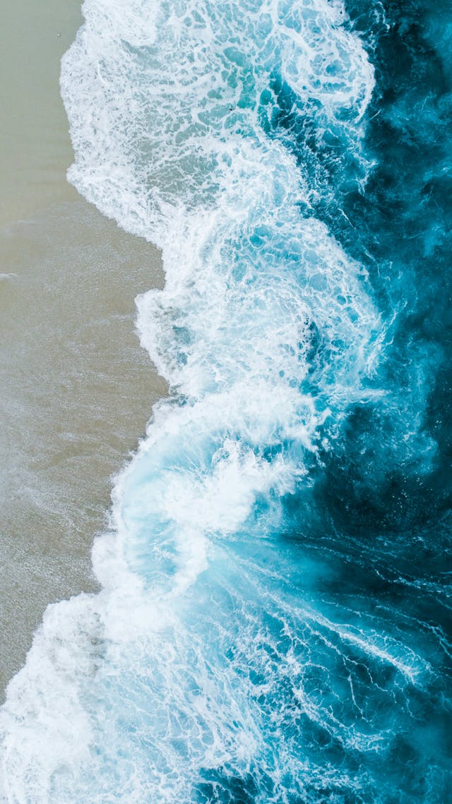
A Masonry layout is a grid layout where the columns are of different heights. This is a very popular layout and is used by Pinterest and many other websites. It looks good on the website (and even we use it on Aceternity).
To Create a Masonry Layout, we create a wrapper grid for every column and then add the content inside it. Let's take a look at the code.
Here, let's understand the basics:
- Every column is a grid with
1 columnandgap-2(2px gap between each row) - The wrapper grid is a grid with
3 columnsandgap-2(2px gap between each column) - The inside Grid is where the content is added. It is a grid with
1 columnandgap-2(2px gap between each row). The image are of different heights to make it look uneven.
Creating a Bento Grid Layout With Tailwindcss Grid
Bento grids offer exceptional versatility, ideal for presenting a variety of content types such as images, text, and mixed media. They efficiently display a large amount of content in a compact and structured manner, enhancing the aesthetic appeal and user engagement of your website or application.
Here, we make use of the col-span-2 class to make the image span across 2 columns. This is what makes the layout look like a bento box.
Conclusion
In this article, we learned how to create amazing Grid layouts with Tailwindcs grid and React. We learned how to create a simple grid, a masonry grid, and a bento grid. I hope you learned something new today. If you have any questions, feel free to reach out to me on Twitter.
posted by Manu Arora