How to create a modern card design with Tailwind CSS and Nextjs
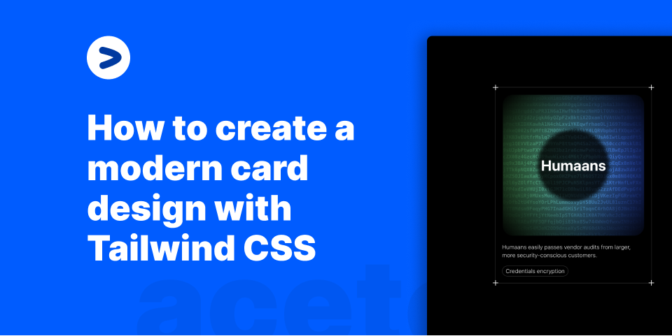
Recently, I came across a design at Evervault that I really liked. It was a card design with a background encrypted text and a hover effect. I thought it would be a great idea to create a tutorial on how to create this design using Tailwind CSS. In this tutorial, we are going to create a card that looks something like this:

Page structure
  return (
    <div>
      <Head>
        <title>Card as seen on Evervault's customer page</title>
      </Head>
      <main className="h-screen bg-black w-full flex items-center justify-center antialiased">
        <div className="border border-white/[0.2] flex flex-col items-start max-w-sm mx-auto p-4 relative">
          <Icon className="absolute h-6 w-6 -top-3 -left-3 text-white" />
          <Icon className="absolute h-6 w-6 -bottom-3 -left-3 text-white" />
          <Icon className="absolute h-6 w-6 -top-3 -right-3 text-white" />
          <Icon className="absolute h-6 w-6 -bottom-3 -right-3 text-white" />
          <Card />
          <h2 className="text-white mt-4 text-sm font-light">
            Humaans easily passes vendor audits from larger, more
            security-conscious customers.
          </h2>
          <p className="text-sm border font-light border-white/[0.2] rounded-full mt-4 text-white px-2 py-0.5">
            Credentials encryption
          </p>
        </div>
      </main>
    </div>
  );
}
export const Icon = ({ className, ...rest }) => {
  return (
    <svg
      xmlns="http://www.w3.org/2000/svg"
      fill="none"
      viewBox="0 0 24 24"
      strokeWidth="1.5"
      stroke="currentColor"
      className={className}
      {...rest}
    >
      <path strokeLinecap="round" strokeLinejoin="round" d="M12 6v12m6-6H6" />
    </svg>
  );
};
Here, we lay out a structure of the page that holds the card. This includes:
- A
<Card />component that will hold the card content - A
<Head />component that will hold the page title - An
<Icon />component that will hold the icons aligned on the corners. The whole design of the card is divided into two parts: - The
Card />component will have the hover effect (A glowing background on mouse move and encrypted background text). - The
<h2 />and<p />tags will hold the card content. These are outside of the hover scope and are static text content. Let's take a look at theCard />component.
Card component
export const Card = () => {
  let mouseX = useMotionValue(0);
  let mouseY = useMotionValue(0);
  const [randomString, setRandomString] = useState("");
  useEffect(() => {
    let str = generateRandomString(1500);
    setRandomString(str);
  }, []);
  function onMouseMove({ currentTarget, clientX, clientY }) {
    let { left, top } = currentTarget.getBoundingClientRect();
    mouseX.set(clientX - left);
    mouseY.set(clientY - top);
    const str = generateRandomString(1500);
    setRandomString(str);
  }
  return (
    <a
      href={`https://aceternity.com/templates?ref=stackblitz`}
      target="\_\_blank"
      className="p-0.5 bg-transparent aspect-square flex items-center justify-center w-full h-full relative"
    >
      <div
        onMouseMove={onMouseMove}
        className="group rounded-3xl w-full relative overflow-hidden bg-transparent flex items-center justify-center h-full"
      >
        <CardPattern
          mouseX={mouseX}
          mouseY={mouseY}
          randomString={randomString}
        />
        <div className="relative z-10 flex items-center justify-center">
          <div className="relative h-44 w-44  rounded-full flex items-center justify-center text-white font-bold text-4xl">
            <div className="absolute w-full h-full bg-black/[0.8] blur-sm rounded-full" />
            <span className="text-white z-20">Humaans</span>
          </div>
        </div>
      </div>
    </a>
  );
};
export function CardPattern({ mouseX, mouseY, randomString, ...gridProps }) {
  let maskImage = useMotionTemplate`radial-gradient(250px at ${mouseX}px ${mouseY}px, white, transparent)`;
  let style = { maskImage, WebkitMaskImage: maskImage };
  return (
    <div className="pointer-events-none">
      <div className="absolute inset-0 rounded-2xl  [mask-image:linear-gradient(white,transparent)] group-hover:opacity-50"></div>
      <motion.div
        className="absolute inset-0 rounded-2xl bg-gradient-to-r from-green-500 to-blue-700 opacity-0  group-hover:opacity-100 backdrop-blur-xl transition duration-500"
        style={style}
      />
      <motion.div
        className="absolute inset-0 rounded-2xl opacity-0 mix-blend-overlay  group-hover:opacity-100"
        style={style}
      >
        <p className="absolute inset-x-0 text-xs h-full break-words whitespace-pre-wrap text-white font-mono font-bold transition duration-500">
          {randomString}
        </p>
      </motion.div>
    </div>
  );
}
The <Card /> is a bit complex. It has a lot of moving parts. Let's break it down.
Card component structure
To get the glowing effect when the mouse move, we use framer-motion to animate the background.
- We use the
useMotionValuehook to get the mouse position. - We then use the
useMotionTemplatehook to create a template string that will be used to create themaskImagestyle.
let maskImage = useMotionTemplate`radial-gradient(250px at ${mouseX}px ${mouseY}px, white, transparent)`;
let style = { maskImage, WebkitMaskImage: maskImage };
- We then use the
styleprop to apply themaskImagestyle to themotion.divcomponent.
<motion.div
  className="absolute inset-0 rounded-2xl bg-gradient-to-r from-green-500 to-blue-700 opacity-0  group-hover:opacity-100 backdrop-blur-xl transition duration-500"
  style={style}
/>
This way, we can essentially mask the background to show only the background visible within the radial-gradient radius.
Card component content
The content of the card is a simple <div /> with a relative position. This is where we will place the card content.
<a
  href={`https://aceternity.com/templates?ref=stackblitz`}
  target="\_\_blank"
  className="p-0.5 bg-transparent aspect-square flex items-center justify-center w-full h-full relative"
>
  <div
    onMouseMove={onMouseMove}
    className="group rounded-3xl w-full relative overflow-hidden bg-transparent flex items-center justify-center h-full"
  >
    <CardPattern mouseX={mouseX} mouseY={mouseY} randomString={randomString} />
    <div className="relative z-10 flex items-center justify-center">
      <div className="relative h-44 w-44  rounded-full flex items-center justify-center text-white font-bold text-4xl">
        <div className="absolute w-full h-full bg-black/[0.8] blur-sm rounded-full" />
        <span className="text-white z-20">Humaans</span>
      </div>
    </div>
  </div>
</a>
Here, the header text Humaans is given a background blur to show the background encrypted text a bit. This is done using the blur-sm class.
The <CardPattern /> component is embedded here along with mouseX and mouseY values. These values are passed to the <CardPattern /> component to animate the background.
As and when the mouse moves, A background gradiend which is going from green to blue is shown. This is carried out using the group class of tailwindcss.
Whenever there is a group-hover, meaning the entire card is hovered over, the background gradient is shown. Otherwise the opacity of the background is set to 0.
Text encryption effect.
The text that you see in the background is pretty simple to pull off.
- We create a
generateRandomStringfunction to generate a random string.
const characters =
  "ABCDEFGHIJKLMNOPQRSTUVWXYZabcdefghijklmnopqrstuvwxyz0123456789";
export const generateRandomString = (length) => {
  let result = "";
  for (let i = 0; i < length; i++) {
    result += characters.charAt(Math.floor(Math.random() * characters.length));
  }
  return result;
};
- We then use the
useEffecthook to generate a random string and set it to therandomStringstate.
useEffect(() => {
  let str = generateRandomString(1500);
  setRandomString(str);
}, []);
This is then passed as a prop to the <CardPattern /> component and can be displayed in the background.
How does the text move?
Whenever the mouse moves, we generate the string again and set it to the randomString state. This way, the text moves as the mouse moves.
function onMouseMove({ currentTarget, clientX, clientY }) {
  let { left, top } = currentTarget.getBoundingClientRect();
  mouseX.set(clientX - left);
  mouseY.set(clientY - top);
  const str = generateRandomString(1500);
  setRandomString(str);
}
Conclusion
In this article, we have seen how to create a card component with a glowing effect when the mouse moves over it. We have also seen how to create a text encryption effect. Shoutout to Evervault's team for the inspiration and coming up with such amazing designs. You can find the source code for this article on Stackblitz.
posted by Manu Arora