How to create a moving border effect with Tailwind CSS
Recently, I came across a cool effect which appears to be a border that rotates and moves around the card.
I thought it would be a great effect to add to my projects, helping buttons and cards to stand out.
So, I decided to create a tutorial on how to create this effect with Tailwind CSS only.
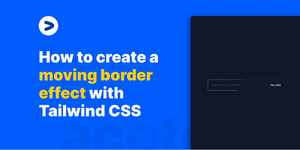
Here's a preview of what we are going to create with just Tailwind CSS.
Code explanation
Basically we have 3 moving parts here:
- The outer container which contains the
inputand thebuttonelements. - An
absolutelypositioneddivthat acts as the background moving border. - The inside elements which are
inputandbuttons. The meaty part is theabsolutelypositioned div. Let's take a look at the code snippet
<div class="mx-auto flex w-full max-w-lg items-center justify-center">
  <div
    class="relative z-10 flex w-full cursor-pointer items-center overflow-hidden rounded-xl border border-slate-800 p-[1.5px]"
  >
    <div
      class="animate-rotate absolute inset-0 h-full w-full rounded-full bg-[conic-gradient(#0ea5e9_20deg,transparent_120deg)]"
    ></div>
    <div class="relative z-20 flex w-full rounded-[0.60rem] bg-slate-900 p-2">
      <input
        type="text"
        class="mr-2 inline-block h-full flex-1 rounded-lg bg-transparent px-2 py-3 text-gray-500 placeholder:text-slate-700 focus:outline-none focus:ring-1 focus:ring-cyan-500"
        placeholder="subscribe to our newsletter"
      />
      <span
        class="relative z-50 block rounded-lg border border-slate-800 bg-slate-900 px-8 py-3 text-center text-sm text-white shadow-2xl transition duration-200 hover:bg-slate-800"
      >
        Subscribe
      </span>
    </div>
  </div>
</div>
/** @type {import('tailwindcss').Config} */
module.exports = {
  theme: {
    extend: {
      animation: {
        rotate: "rotate 10s linear infinite",
      },
      keyframes: {
        rotate: {
          "0%": { transform: "rotate(0deg) scale(10)" },
          "100%": { transform: "rotate(-360deg) scale(10)" },
        },
      },
    },
  },
  plugins: [],
};
Here, the meaty snippet is
<div
  class="animate-rotate absolute inset-0 h-full w-full rounded-full bg-[conic-gradient(#0ea5e9_20deg,transparent_120deg)]"
></div>
The outer container is positioned relative so that the inner absolutely positioned div can be positioned absolute relative to the outer container.
We apply a conic-gradient to the div, which goes from blue to transparent. This is the moving border effect that we animate with keyframes
keyframes: {
  rotate: {
    "0%": { transform: "rotate(0deg) scale(10)" },
    "100%": { transform: "rotate(-360deg) scale(10)" },
  },
},
The rotate property makes it go from 0 to 360 degrees in 10 seconds. The scale property makes it go from 10 to 10. This is what makes the border move around the card.
Conclusion
I hope you enjoyed this tutorial. If you have any questions, feel free to ask them on twitter. I'm @mannupaaji on twitter.
posted by Manu Arora