Most startups build their first website in a hurry. That is the right call. But products, teams and markets change fast, and the website is often the last thing to catch up.
Here are ten signs that your website is now holding you back.
1. You explain the product better on calls than the website does
If prospects only "get it" once you show them a demo, the website is not doing its job. Your homepage should explain what you do, who it is for and why it matters within one scroll.
2. Your positioning changed, but the homepage did not
You found a new ideal customer, a new use case or a new category. The website still tells the story from your first pitch deck. Every visitor now gets the wrong first impression.
3. It looks older than your competitors
Buyers compare. If your competitors look sharper, visitors assume their product is better too, even when it is not.
4. The site does not show the real product
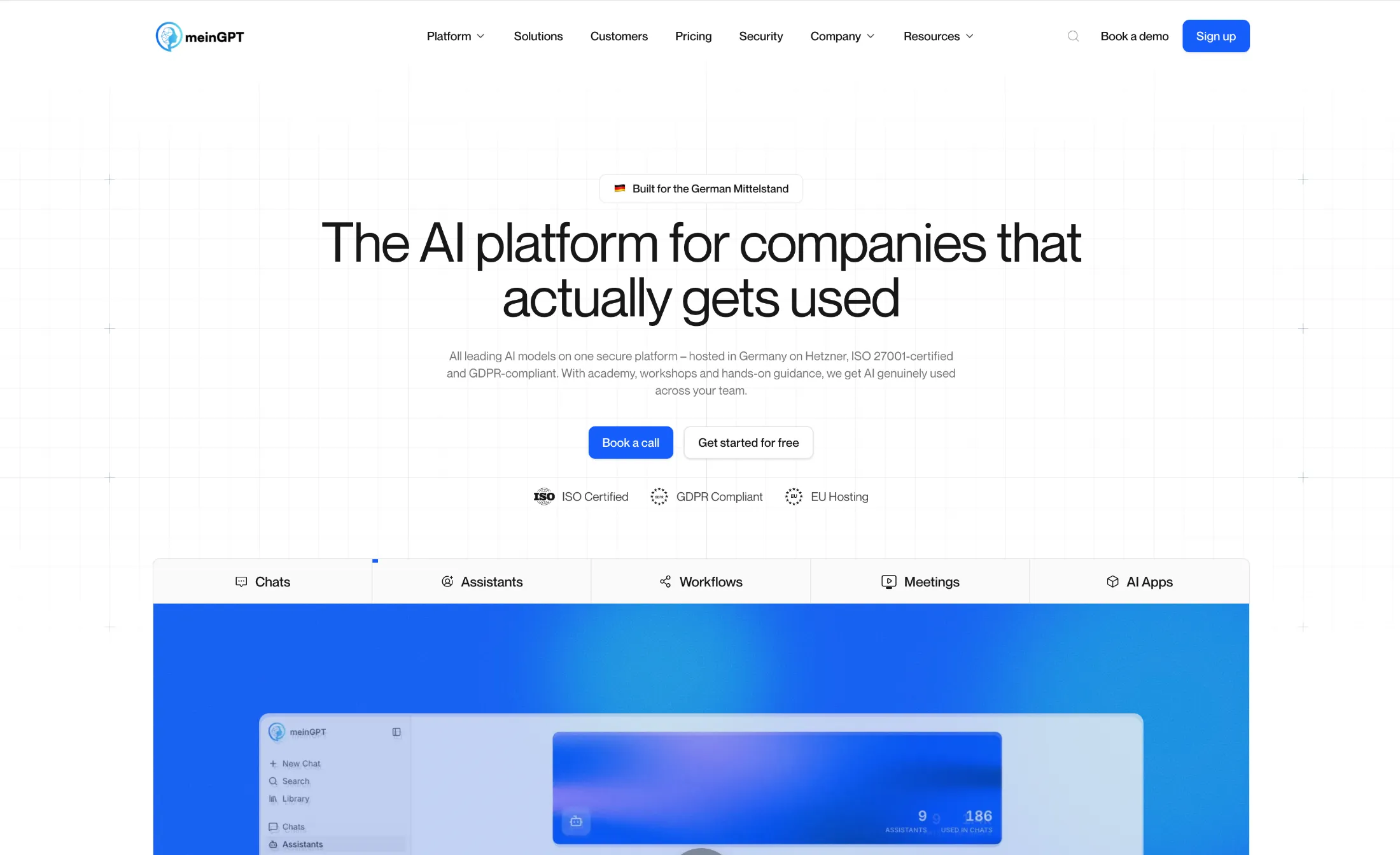
Generic illustrations and stock photos do not sell software. Buyers want to see the interface, the workflow and the speed. If your product has improved a lot since launch, the website should show it.
5. Marketing waits on engineering for every change
If a new landing page or a headline test needs a developer and a sprint, you are moving too slowly. A good website lets marketing publish without a ticket.
Want a second opinion on your website?
6. It is slow, especially on mobile
Slow pages lose visitors and hurt search rankings. Run your homepage through Google PageSpeed Insights on mobile. If the scores are poor, a rebuild on a modern stack can fix more than a pile of plugins can.
7. There is no clear next step
Look at your homepage and count the calls to action. If there are five different buttons, or none above the fold, visitors do not know what to do next. Pick one primary action, like "Book a demo" or "Start free", and make it obvious.
8. You are embarrassed to share the link
This one is simple. If you hesitate to send the website to an investor, a candidate or a big prospect, it needs work.
9. You raised, and the website still looks like a side project
After a funding round, more people visit your site: investors, press, candidates and customers. A website that looks like a weekend project makes a well-funded team look small.
10. Traffic comes in, but leads do not
If analytics show steady traffic but few sign-ups or demo requests, the problem is usually the message, the proof or the path to action, not the traffic itself.
What to fix first
You do not need to rebuild everything at once. In most cases, the biggest win comes from:
- The homepage hero. A clear headline, one sentence of value and one main call to action.
- Proof. Logos, testimonials and short case studies near the claims they support.
- The product. Real screenshots or interactive previews of the product.
- Speed. Images, fonts and scripts on the pages that get the most traffic.
If three or more of the signs above sound familiar, it is probably time for a redesign. We can help you decide where to start.
Not sure where to start?
Book a short call and share your website. Manu will tell you the first three things we would change. Free, no obligation.